
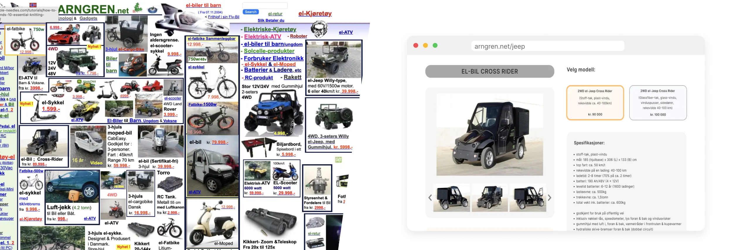
Summary
concept project | february 2024 | 4 weeks
For this UX/UI redesign project, I focused on improving one specific aspect of universal design on the Arngren website, a site known for its cluttered interface and accessibility challenges.
Through user research, participatory design methods, and usability testing, I identified barriers affecting navigation and cognitive load, and translated these insights into a more intuitive, inclusive interface. The final prototype demonstrates how targeted accessibility improvements can significantly enhance the overall user experience.
Through user research, participatory design methods, and usability testing, I identified barriers affecting navigation and cognitive load, and translated these insights into a more intuitive, inclusive interface. The final prototype demonstrates how targeted accessibility improvements can significantly enhance the overall user experience.
My role
UX Designer
Methods
UX research
Participatory design
Usability testing
Prototyping
Wireframing
Accessibility evaluation
Tools
Figma
Paper prototyping
Post-it notes
Deliverables
Hi-fi prototype, Lo-fi wireframes, User research findings, Accessibility recommendations
Challenge & process
Defining the main challenge and outlining the approach
The challenge
Arngren.net is known for its cluttered interface, inconsistent visual hierarchy, and overwhelming amount of content, making it difficult for users to navigate and trust the website. Instead of redesigning the entire website, I focused on identifying the accessibility and usability issues that had the greatest impact on users.
Using a participatory design approach, I involved a user throughout the design process, from research and prototyping to usability testing, to develop a solution grounded in user needs and universal design principles.
Using a participatory design approach, I involved a user throughout the design process, from research and prototyping to usability testing, to develop a solution grounded in user needs and universal design principles.
The process
01
Understanding the design approach
Explored participatory design principles and how to apply them throughout the project.
02
Defining the accessibility focus
Reviewed WCAG guidelines and selected a specific universal design challenge to address within the project.
03
Conducting initial user research
Interviewed a participant to identify usability issues and accessibility barriers.
04
Exploring design solutions
Prioritised design opportunities based on user research findings.
05
Designing and testing lo-fi prototypes
Created and iterated low-fidelity prototypes through participatory usability testing.
06
Developing the final prototype
Refined the design into a high-fidelity prototype based on user feedback and WCAG principles.
Defining the accessibility focus
Defining the accessibility goals that would shape the redesign
Rather than attempting to solve every accessibility issue on Arngren.net, I narrowed the project's scope to the challenges most relevant to my participant - a user without visual or hearing impairments, but with a low tolerance for cluttered and poorly designed interfaces.
The redesign was therefore guided by three WCAG success criteria:
The redesign was therefore guided by three WCAG success criteria:
2.4.3 Focus Order (Level A) – Ensure content follows a logical and meaningful flow.
2.4.6 Headings and Labels (Level AA) – Establish a clear visual hierarchy through descriptive headings and labels.
3.2.4 Consistent Identification (Level AA) – Maintain consistent interface patterns to improve recognition and usability.
Understanding the user
Exploring the user's experience to identify key pain points
To better understand the challenges users face on Arngren.net, I conducted a 40-minute semi-structured interview with one participant. I explored the user's online shopping habits before observing their experience navigating the website. The goal was to uncover usability issues and identify opportunities for improving the user experience.
Initial findings
01
The website feels difficult to navigate
The participant found the website chaotic and difficult to navigate, describing it as if everything was “just thrown together.” Products were difficult to find due to excessive scrolling and a lack of clear structure.
Key feedback included:
Key feedback included:
“Many different products, but little information about them.”
“It’s quantity over quality.”
“The website is chaotic and badly organised.”
02
Product pages don’t match user expectations
The participant found that product links often led to unrelated or unexpected pages, creating frustration and disappointment. Poor content relevance made it harder to complete tasks and weakened trust in the website.
Key example provided was:
Key example provided was:
“When I click on a product, I see everything else but what I want.”
03
The design makes the website feel untrustworthy
The participant felt the visual design was outdated and overwhelming, with cluttered images, strong colour contrasts, and poor typography. The overall appearance reduced credibility and made the participant hesitant to shop.
For instance:
For instance:
“It feels like the website is screaming desperation to sell.”
“It looks unprofessional and makes me feel like I might get scammed.”
Overall, the participant's feedback suggested that the website does not inspire confidence to make a purchase. The cluttered layout, poor organisation, and misleading content created a frustrating browsing experience that reduced trust in the website and made the participant unlikely to shop there.
Exploring design solutions
Turning research findings into design opportunities
After identifying the main usability issues, I prioritised the areas that had the greatest impact on the participant's experience. Instead of redesigning the entire website, I focused on the product page because it was where the participant's main frustrations occurred and where improvements could have the greatest impact on the overall experience.
Potential solutions
01
Simplifying product information
Problem: The user struggled to find the most important product information because the page was cluttered and lacked hierarchy.
Design decision: Display only essential information first: a concise description, key specs, one main image, and additional images below. Remove unrelated content.
02
Reducing distractions
Problem: Unrelated products appeared alongside the main content, making it difficult for the user to stay focused on the product they were viewing.
Design decision: Rather than removing these products altogether, I decided to try moving them further down the page into dedicated sections such as "Recommended Products" and "New Arrivals". This allows users to continue browsing without interrupting their primary task.
03
Improving visual hierarchy
Problem: Cluttered layout, inconsistent spacing, and dense content made the interface feel overwhelming and difficult to scan.
Design decision: Introducing more whitespace and groupping related content more consistently to create a clearer visual hierarchy, making the page easier to navigate while also improving its overall credibility.
Focusing on high-impact improvements
Not every usability issue would significantly improve the overall experience if addressed. Although I considered improving the "Read More" button, I chose not to prioritise it because it had relatively little impact on the participant's main frustrations. Interestingly, in a follow-up interview, the participant highlighted exactly the same elements I had focused on, reinforcing the relevance of these improvements.
Usability testing
Designing and testing lo-fi prototypes
To validate my design ideas, I created low-fidelity prototypes and tested them with the same participant. The goal was to understand whether the proposed changes improved usability and to identify opportunities for further refinement.
Creating the prototype
To explore and test my design ideas, I created a low-fidelity paper prototype of a product page featuring a simple two-column layout as well as simplified product information. Keeping the prototype intentionally low fidelity allowed me to test the structure without having the user get distracted by visual details.
After an initial review, I developed a second, more interactive version using movable post-it notes. This allowed the participant to rearrange elements during usability testing, encouraging discussion and making it easier to understand how they would expect the page to be organised.
After an initial review, I developed a second, more interactive version using movable post-it notes. This allowed the participant to rearrange elements during usability testing, encouraging discussion and making it easier to understand how they would expect the page to be organised.
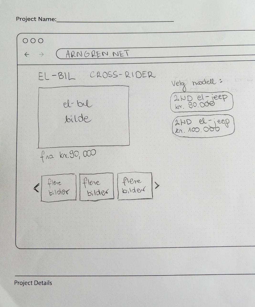
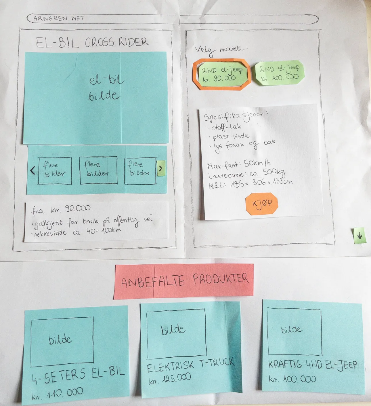
The first lo-fi prototype (on the left/top) and the extended version of the second lo-fi prototype used during usability testing (on the right/bottom).
Testing the prototype
To evaluate the proposed design, I conducted a second usability session with the same participant using the interactive paper prototype.
Rather than asking the participant to design the page from scratch, I presented an initial concept based on the findings from the first interview. This provided a starting point for discussion while still encouraging them to rearrange elements, challenge decisions, and suggest improvements throughout the session.
The goal was to understand the following aspects:
Rather than asking the participant to design the page from scratch, I presented an initial concept based on the findings from the first interview. This provided a starting point for discussion while still encouraging them to rearrange elements, challenge decisions, and suggest improvements throughout the session.
The goal was to understand the following aspects:
- Does the new layout feel easier to navigate?
- Can the user find the most important information more quickly?
- What improvements would make the experience feel more trustworthy?
The usability test revealed three key insights that influenced the next iteration of the design.
Key findings
01
The new layout felt more organised
The participant's first impression of the redesigned product page was positive, describing it as having "much more structure" than the original website. They found the two-column layout easier to scan and appreciated being able to browse product images without leaving the page.
02
Clear functionality mattered more than visual details
The participant placed greater importance on understanding how the interface worked than on visual styling. Clear affordances, such as button contrast, helped them recognise which elements were interactive.
"For me, contrast indicates something I can click on."
03
Need for more context before making a purchase
When exploring the prototype, the participant preferred having both "Recommended Products" and "Others Also Bought", explaining that each served a different purpose. They also suggested limiting each section to three products to avoid it being overwhelming.
Unexpectedly, they highlighted product reviews as an important part of the shopping experience, suggesting they should appear before product recommendations to help users make informed decisions.
Unexpectedly, they highlighted product reviews as an important part of the shopping experience, suggesting they should appear before product recommendations to help users make informed decisions.
The general impression from this usability testing session was that the prototype encouraged collaboration. Using movable paper elements encouraged the participant to actively rearrange the layout, question design decisions, and suggest improvements throughout the session. This collaborative approach generated more detailed feedback than discussing static wireframes alone.
Final design
Developing the final prototype based on user feedback
Based on the insights gathered throughout the research and usability testing, I developed a high-fidelity prototype that addressed the participant's main frustrations. I focused on improving the product page by creating a clearer structure, reducing clutter, and making it easier to find relevant information.
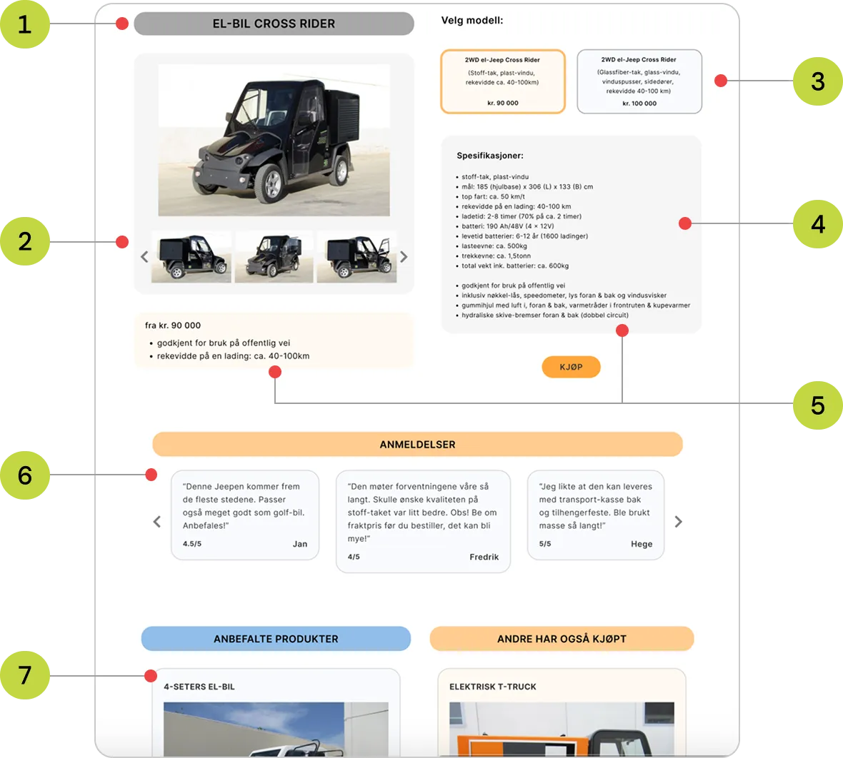
High-fidelity prototype with numbered annotations explaining the main design decisions.
Key design decisions
The final prototype reflects the key insights gathered throughout the project. The numbered callouts explain the key design decisions and how they address the participant's main usability issues. They were grouped into themes and are presented below.
Clearer product information
Includes: 1, 2 and 5
Issue addressed: The participant struggled to find relevant information and felt overwhelmed by the page.
- 1. The page title now clearly shows which product the user is viewing.
- 2. An image gallery allows users to browse multiple images without overwhelming the page with full-size content.
- 5. Information is organised into a clear two-column layout, displaying only content relevant to the selected product.
Better visual hierarchy
Includes: 3 and 4
Issue addressed: The interface felt cluttered and overwhelming, making it difficult to distinguish different types of content and identify interactive elements.
- 3. Buttons use borders and background colors to clearly indicate interactive elements.
- 4. Background colors separate different types of content, making the page easier to scan and navigate.
Increased trust
Includes: 6
Issue addressed: The participant found the website untrustworthy and lacked confidence in making a purchase.
- 6. Product reviews provide social proof and help users make more informed purchasing decisions, increasing trust in both the product and the website.
Reducing distractions
Includes: 7
Issue addressed: Unrelated products interrupted the browsing experience and made it harder for the user to stay focused on the product they were viewing.
- 7. Related products are grouped into dedicated sections such as "Recommended Products" and "Customers Also Bought", allowing users to discover additional items without distracting from their primary task.
Validation & user feedback
Due to time constraints, I was unable to conduct a third usability test of the hi-fi prototype. Instead, I held a follow-up conversation with the participant to gather feedback on the final design.
- The redesign felt more organised and easier to navigate. The participant found the product page significantly less chaotic compared to the original, which was the main goal of the redesign.
- The new structure supported product discovery. They appreciated the grouping of related products under “Recommended Products” and “Customers Also Bought”, as it made it easier to compare and understand different offerings.
- The design increased trust in the website. Product reviews, a simplified color scheme, and consistent typography made the website feel more professional and increased confidence in both the website and the products.
- Some opportunities remained for future improvements. The participant suggested adding a "back" button to improve navigation and further refining the site's overall navigation.
Reflections
What I learned from this project
The prototype testing process reinforced the value of involving users throughout the design process. By encouraging the participant to interact with the prototype and explain their thoughts, I gained deeper insights into their priorities and the reasoning behind their feedback.
Compared to the initial interview, I approached the usability testing session with more confidence and asked more targeted follow-up questions. This helped me uncover more specific insights, validate my design decisions, and identify areas for further improvement.
Compared to the initial interview, I approached the usability testing session with more confidence and asked more targeted follow-up questions. This helped me uncover more specific insights, validate my design decisions, and identify areas for further improvement.