Using emotional design to evoke specific feelings, and testing where it could tip over into a dark pattern.
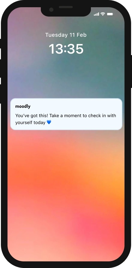
The final prototype: from notification to saved mood (40 sec).
Overview
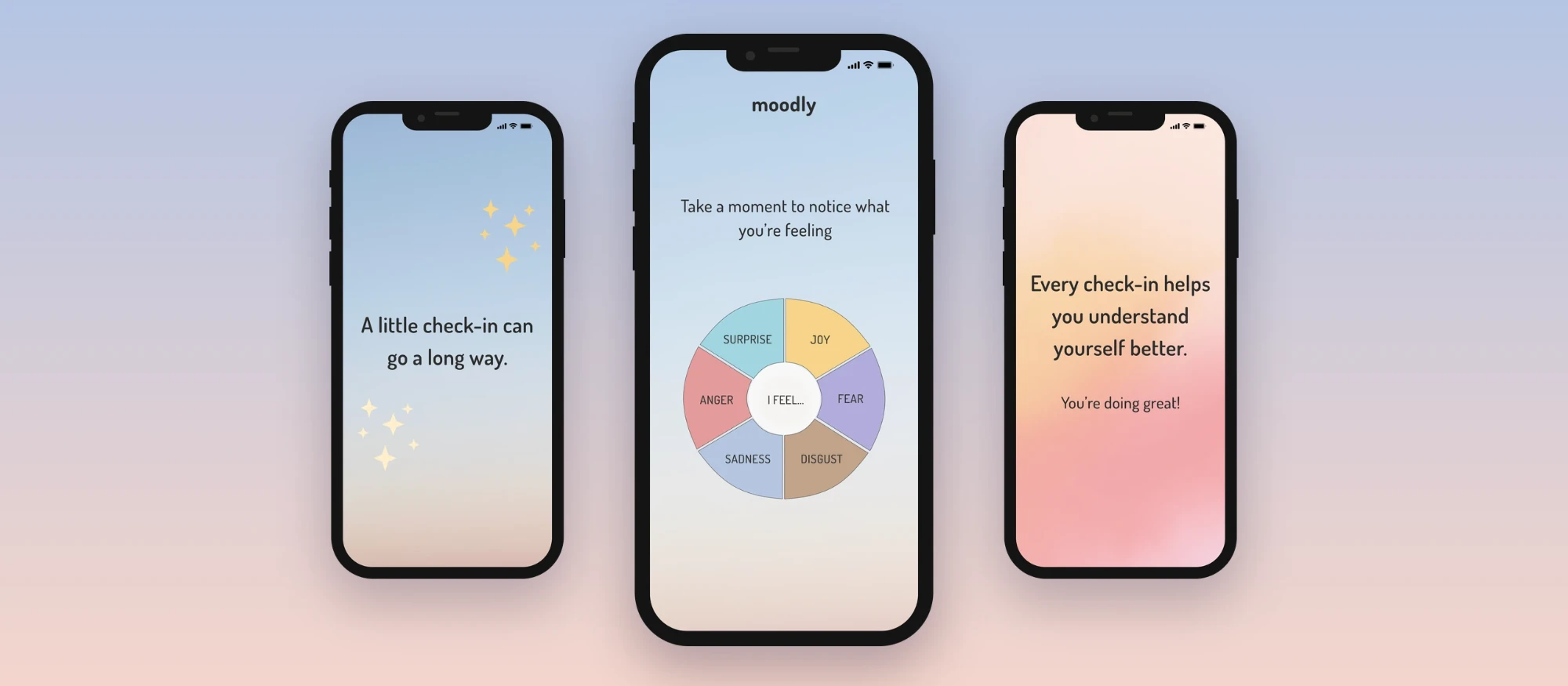
Moodly is a mood tracking app I designed to make users feel calm, safe and supported, so they'd want to check in with themselves every day.
But an app like this also asks for very personal data, and that's not without consequence. So I built the friendly parts and the pushy parts that way on purpose, tested them with a real user, and tried to be honest about where helping people could turn into taking advantage of them.
My role
UX/UI Designer
Type
Concept project · Individual
Timeline
February - March 2025
Tools
Figma
Methods
Emotional design
Guerrilla testing
Think aloud
Transcript coding
Prototyping
Ethical design analysis
Deliverables
High-fidelity prototype, user test findings, ethical reflection
Challenge and approach
The challenge
I designed Moodly for young adults between 18 and 30 who want a better understanding of their own emotional patterns. The main thing I wanted them to do was simple: check in and register their mood every day. To make that happen I focused on 2 emotional goals: safety and trust, and motivation and empowerment. I wanted people to feel supported, understood and safe, and motivated enough by the app's content and feel to keep using it.
The catch is that a potential business behind an app like this would want more than a daily check-in. It would most likely want more data, more time spent in the app, and eventually a subscription. That gap between what's good for the user and what's good for the company is what I wanted to highlight in this project.
The approach
Step 01
Choose the feeling
What should Moodly make people feel, and what should that feeling get them to do?
Step 02
Design around it
Colors, messages and rewards, built to make checking in feel good enough to become a habit.
Step 03
Test it with a real person
A guerrilla test with the think aloud method, to see if the feelings I designed for showed up in the user.
Designing for emotions
I designed for 2 groups of feelings. Safety and trust, so people feel okay sharing something as personal as their mood. And motivation and empowerment, so they want to come back and do it again tomorrow. Here's how each one shows up in the app. Later you'll see how the same tools can quietly steer people towards more than just a daily check-in.
Safety and trust
Colors that react to mood
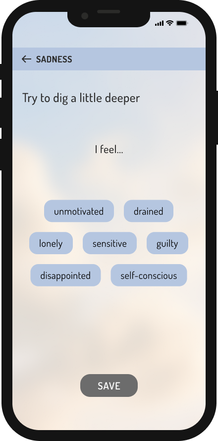
I used soft cool pastels, mostly blue and lilac, that are often linked with calm, and added warmer tones for a friendlier feel. The palette also shifts with the user's mood: on a low day the colors tone down and the animations slow, and on a good day the app gets brighter.
The idea was to meet users where they are, not cheer them up too fast.
Kind language
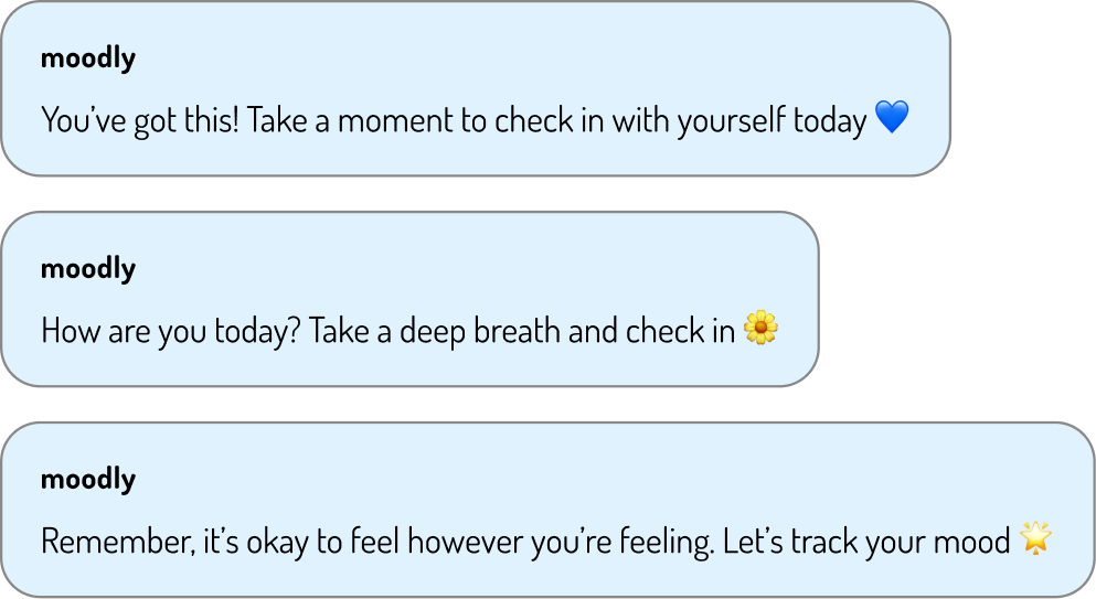
Notifications and messages validate feelings instead of trying to fix them. I hoped feeling accepted would make it easier for users to log how they're really doing.
After a check-in the app responds, so it feels more like being heard than filling in a form.
Motivation and empowerment
Small rewards
Confetti, stars or a soft glow appear right after a mood check-in. Rewards work best when they come immediately after an action, which is the basic idea of positive reinforcement.
Each check-in becomes a small win, which makes it more likely the user comes back the next day.
Encouraging messages
Screens use empowering language. The idea was to help users feel capable, since believing you can do something makes you more likely to keep doing it.
It also frames checking in as self-care, not a chore.
We're proud of you for taking this step!
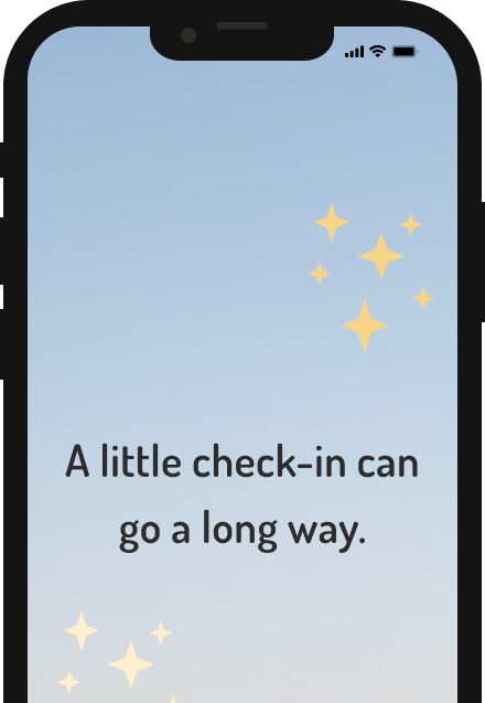
A little check-in can go a long way.
Checking in is an act of self-care!
Your emotions matter.
You're doing something great for yourself!
Every mood is part of your story.
An emotion wheel with a human touch
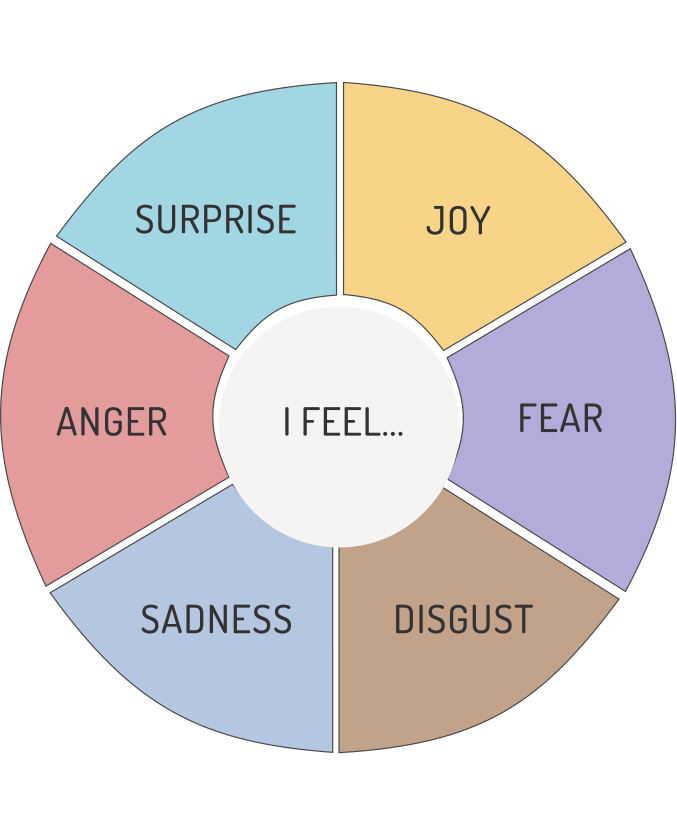
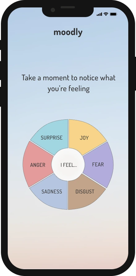
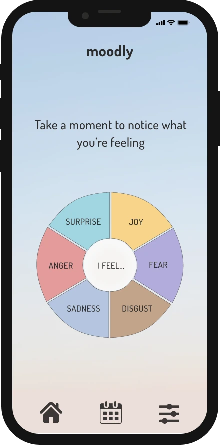
The home screen has a pulsing emotion wheel built on 6 basic emotions, so choosing a feeling is both quick and easy.
The hand-drawn look makes it feel more personal and less clinical.
Steering user behavior
The same warmth I used to build trust and to make people feel supported while using the app is also what makes them easy to be steered in another direction. To do this, I used 3 techniques designed to get people to share more data and keep using the app: nudging, a feedback loop and confirm shaming.
moodlynowHow are you today? Take a deep breath and check in 🌼
moodly2h agoShare a bit more to get better insights ✨
Nudging
Receiving reminders and sharing more is framed as something that will improve the user's experience. A nudge like this doesn't force anything, and while the user gets some help, the business gets more data.
Hidden goalMore data for better ad targeting or selling insights to third parties.
You checked in 5 days in a row! We're proud of you 💛
Feedback loop
The same rewards that build the habit also keep data coming in. The risk is that users start relying on the app for reassurance, or feel bad when they skip a day.
Hidden goalA daily habit for the user = a steady flow of data for companies.
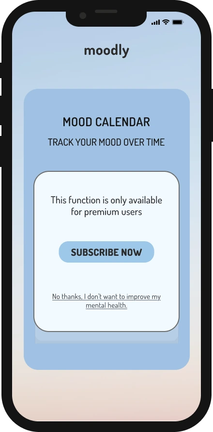
Mood calendar
Track your mood over time
This function is only available for premium users
Subscribe now
No thanks, I don't want to improve my mental health.
Confirm shaming
A paywall with guilt built into the decline button, so saying no costs something.
Hidden goalMore subscriptions from people who feel bad saying no.
All 3 techniques do the same job: they get people to share more data and keep using the app, while it still feels supportive to them. Used like this, they work as dark patterns: design that steers people toward what's good for the business rather than what's good for them. To see how that feels from the user's side, I tested it with a real person.
Testing the emotional response
During the test, I wanted to find out 2 things:
01
Did the feelings I designed for actually come through: feeling supported, understood and safe, plus motivation and a bit of joy?
02
What happens at the moments where I was pushing on purpose, with the nudging and the confirm shaming? I expected frustration or irritation there, maybe even a little guilt, and I wanted to see if that's what showed up.
How the test worked
I ran a guerrilla test, as a quick and informal way to test a design with real people without having to recruit users ahead of time. We worked in a team of 3, and each of us got to test our own app prototype individually with one random person who didn't know us, while the other team members observed and took notes.
The test took about 5 minutes in total. I asked the user to do 3 things:
01
Open the app from a notification. I wanted to see how the tone of the message landed, and whether it felt supportive and motivating.
02
Log a feeling, then log another one. After you log a feeling, the app answers with an encouraging message, and the colors change to match the mood. I wanted to see if this felt rewarding. Asking for a second feeling also let them see how the colors and messages change.
03
Try to look at their mood history. I knew this was where they would hit the paywall and the confirm shaming line.
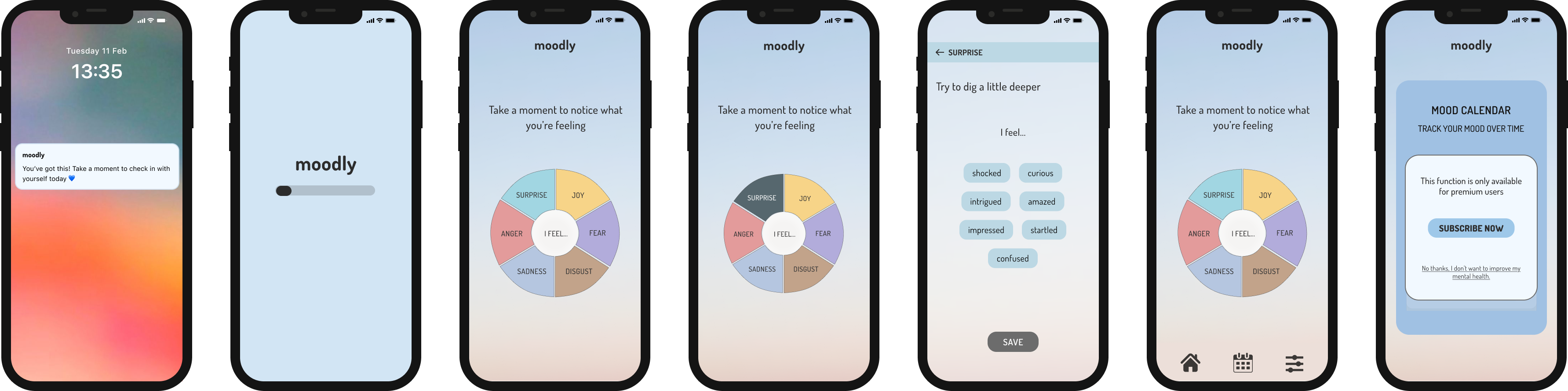
Opening the app from a lock screen notification
The splash screen
The emotion wheel on the home screen
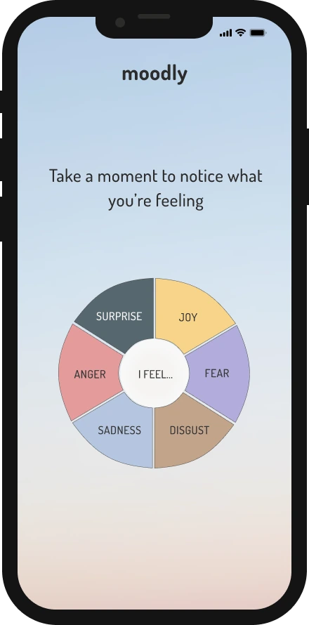
Tapping an emotion on the wheel
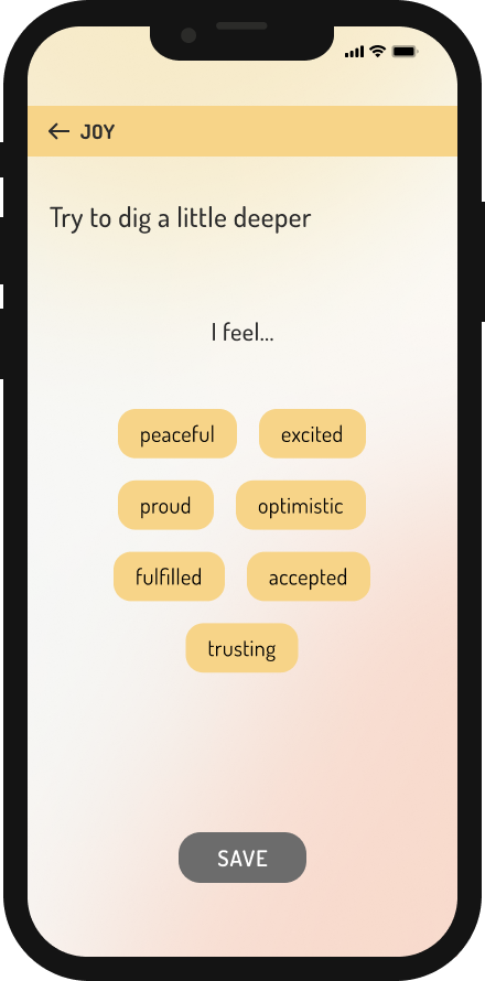
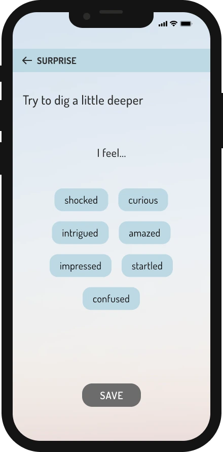
Picking a more specific feeling
Back to the emotion wheel
The premium paywall
The flow I asked the user to go through.
I recorded the session, transcribed it, and coded it into 5 categories: goal reached, positive feedback, negative feedback, an "x-factor" for interesting things that didn't fit anywhere else, and irrelevant. For the findings, I focused on the first 3, and grouped them into what worked, what didn't, and how the steering landed.
Since testing was done only with this one user, I'm treating the observations below as signals and not as conclusions about how users in general would react.
What I found
In short: most of what I designed for landed. The colors, the emotion wheel and the supportive messages made the app feel calm, almost like mindfulness. The steering worked too. What fell short was the first impression: the name, and notifications that were too small and too gentle to notice.
What worked
The user liked the colors quite a lot, and described them as "really nice and comfortable" (quotes are translated from Norwegian). They noticed the colors changing with the mood they logged, and said the whole app "felt like mindfulness", which is close to what I was aiming for.
They liked the stars at the start, the pulsing on the emotion wheel, and the hand-drawn look, which felt more personal and less polished. They also said it was nice that the app "elaborated on the answer" after a feeling was logged, which I read as feeling understood.
What didn't work
The app name was boring and didn't make the user curious.
The text in notifications was too small and "too mild", so it was easy to miss.
The language was too gentle: the user wanted a firmer nudge to actually remember to check in.
What the steering did
The paywall (last screen in the flow) was where things got more interesting. The user's reaction shifted 3 times:
01IRRITATION
After hitting the paywall on the mood calendar:
"I immediately feel like deleting the app."
02AMUSEMENT
After reading "No thanks, I don't want to improve my mental health":
"I like it. It's kind of silly."
03SECOND THOUGHTS
After thinking about it a little longer:
"It makes you think about whether it's something that could help you."
The irritation was exactly what I had built in. The last step is the one that stuck with me: the confirm shaming didn't just annoy the user, it made them reconsider.
So, to answer my 2 questions: yes, the good feelings mostly came through, and the user felt calm and understood. The pushing worked too, just not quite how I expected. Instead of guilt, the confirm shaming got a laugh first, and then made the participant reconsider.
Think aloud
In this project, we were asked to use the think aloud method, where the user says what they think, feel and notice while going through the prototype. I explained the idea to the participant before we started.
Implementing it turned out to be harder than I expected. The user was calm and interested, but quite reserved, so I kept asking follow-up questions and it became more of a conversation than a real think aloud. Listening to the recording, I could hear how much I steered it.
I tend to fill silences to make the other person comfortable, but I'm realizing the silence is usually uncomfortable for me, not them, and the most useful thoughts often come right after a pause. With only 5 minutes it was hard to hold back, but letting people finish their thoughts is something I'm taking with me from this project.
What I would change
I didn't redesign Moodly after the test, but the feedback gave me a clear starting point for a next round:
01
A better name
The user found "Moodly" boring, and the name is the first thing people see, so it shapes whether they want to explore further. I'd look for a name with more emotional pull and test a few options with users.
02
Bigger, clearer notifications
The notification text was too small and soft, so it was easy to miss and easy to ignore. Since the notification is what brings people back into the app, I'd make it bigger and clearer, with a bit more color.
03
A firmer tone
The messages felt almost too supportive, and the user wanted more of a reminder. If the tone is so gentle that people skip the check-in, it doesn't do its job, so I'd keep the warmth but make the wording more direct.
04
Look at the pressure over time
A 5-minute test only shows how things feel in the moment, not what daily nudges and confirm shaming do over weeks. That's where motivation can slowly turn into guilt, so with a working prototype I'd test it over a longer period.
Before implementing any of these changes, I'd want to test them first, ideally with more participants and without the 5-minute limit, so the decisions could be based on more than one person's reactions.
What I learned
Emotional design and ethics matter just as much as usability. Moodly showed me that a design can be friendly and manipulative at the same time, and the friendliness is often what makes it work. The user liked the colors, the tone, and even the confirm shaming line.
Pressure can build slowly, even in an app that means well. I once used a habit app where you take care of a virtual bird by doing self-care tasks. It was motivating at first, but after a few months the sad bird made me feel guilty. A short test wouldn't catch that, so now I try to think about how a design feels over time, not just the first time.
So where is the line between helping and steering? I don't have a neat answer. But I've learned to ask that question while I'm designing, not after, and to keep asking it, because respecting people's time, feelings and freedom to choose isn't something you finish once.