
Summary
internship project | March - may 2025
During my UX internship at Fuglen Coffee Roasters, an Oslo-based café, bar, and coffee roastery, I worked on improving the user experience of the company's global website and webshop. Through usability testing, information architecture analysis, and accessibility evaluation, I identified key usability and accessibility issues and translated them into practical recommendations for future improvements.
My role
UX Design Intern
Methods
Usability testing
User interviews
Information architecture
Heuristic evaluation
WCAG accessibility review
Tools
Figma
FigJam
Chrome DevTools
WAVE
accessScan
Deliverables
UX recommendations report, Accessibility audit, Information architecture review
Challenge & process
Defining the problem and outlining the approach
The challenge
Fuglen's global website and webshop serve different purposes but share a common goal: helping users discover the brand and its products, ultimately supporting sales. I suspected that friction in the user experience could be hindering this goal, but I didn't yet know what the issues were, or whether they existed at all.
My objective was to investigate this suspicion through actual user research and evidence, and to identify the most significant usability and accessibility barriers, and provide practical recommendations to improve the experience and support Fuglen's business goals.
My objective was to investigate this suspicion through actual user research and evidence, and to identify the most significant usability and accessibility barriers, and provide practical recommendations to improve the experience and support Fuglen's business goals.
The process
01
DISCOVER
Understanding the current experience, business goals, and existing website structure
02
EVALUATE
Reviewing information architecture and accessibility
03
TEST
Conducting user interviews and usability testing to gain real insights
04
SYNTHESIZE
Identifying patterns, pain points, and opportunities
05
RECOMMEND
Translating the findings into actionable improvements
Before conducting user research, I reviewed both platforms to better understand their structure and identify areas likely to cause confusion. The initial review helped identify potential usability and accessibility issues, but these were only assumptions at this stage. I wanted to validate them through user testing to understand whether they represented real challenges for users and uncover any issues I might have overlooked.
User testing
Validating assumptions and uncovering user insights
To validate the observations from the initial evaluation, I conducted usability testing across Fuglen’s two digital platforms: the global website and the webshop. Although both platforms represent the same brand, they serve different purposes and therefore required different research approaches.
Global website
Based on the initial review of the global website's information architecture and content, I identified several potential areas of friction to investigate through user testing. I also mapped where key information could be found, to test how easily users could locate it.
Hypotheses
01
Users might struggle to navigate and find information due to duplicated content, two largely overlapping navigation systems, and a lack of breadcrumbs.
02
It might be difficult to understand the website's structure and purpose, including the distinction between the global website and local café websites, and where to find region-specific information.
03
The homepage might be hard to find and content structure might be confusing, due to its mix of news, café locations, external links, and imagery, as well as the lack of a clearly defined space for news and updates.
04
Users might experience readability and visibility issues due to low-contrast text and navigation elements overlapping with page content.
Research approach
Goal: To understand how first-time users perceived and navigated Fuglen's global website. I wanted to identify whether they could easily find key information about the company, its coffee, partnerships, and career opportunities, while also gathering their impressions of the site's overall structure and content.
PARTICIPANTS
- 3 users
- Ages 30-40
- Familiar with online shopping
- Unfamiliar with Fuglen
NOTE
I intentionally recruited participants who had never used Fuglen's website before to observe genuine first impressions and identify issues that existing customers might overlook.
Method: I combined task-based usability testing with the think-aloud method and semi-structured interviews. While participants completed realistic tasks, they verbalized their thoughts and expectations, allowing me to understand both their actions and the reasoning behind them.
Analysis: I analyzed the qualitative data using deductive coding, with predefined codes based on the research goals and relating to navigation, content clarity, accessibility, and overall user experience.
Observations were categorized by severity: Critical, Serious, Minor/Medium, and Low/Suggestion. I also recorded Positive comments/experiences to capture elements that users responded positively to and would like to preserve.
After coding the data, I used affinity mapping to group related observations into broader themes. This helped identify recurring patterns across participants and identify areas with the greatest impact on the user experience.
Observations were categorized by severity: Critical, Serious, Minor/Medium, and Low/Suggestion. I also recorded Positive comments/experiences to capture elements that users responded positively to and would like to preserve.
After coding the data, I used affinity mapping to group related observations into broader themes. This helped identify recurring patterns across participants and identify areas with the greatest impact on the user experience.
Key findings
The themes identified through affinity mapping helped structure the research findings into broader areas of improvement. This led me to three key findings that represent the main challenges users experienced when interacting with Fuglen’s global website.
01
Users struggled to find and understand important information
Participants had difficulty locating details about Fuglen’s story, coffee, partnerships, careers, and contact information. Content was spread across sections, some information was missing, and users expected clearer access to collaborations. Contact details were inconsistent, while information about Fuglen’s history and coffee production was limited, making it harder to build a complete understanding of the brand.
Why it matters: If users can’t find key information, they may leave without understanding what makes Fuglen different or what the brand has to offer.
Why it matters: If users can’t find key information, they may leave without understanding what makes Fuglen different or what the brand has to offer.
02
Website structure and navigation did not always match user expectations
Participants appreciated Fuglen’s distinctive visual identity and images showing the atmosphere at the cafes, but some design choices made the website feel cluttered and harder to navigate. Large amounts of visual content, long pages, and unclear hierarchy affected readability, focus, and the visibility of interactive elements.
Why it matters: Fuglen’s visual identity is a key part of its brand, but when it competes with usability, it can make important information harder to access and reduce the effectiveness of the website.
Why it matters: Fuglen’s visual identity is a key part of its brand, but when it competes with usability, it can make important information harder to access and reduce the effectiveness of the website.
03
Visual design sometimes competed with usability
Users found the navigation difficult to interpret, with some important pages located where they did not expect them. The transition between the global website and webshop also felt disconnected.
Why it matters: When users cannot predict where information is located, they spend more effort on searching for instead of engaging with the content.
Why it matters: When users cannot predict where information is located, they spend more effort on searching for instead of engaging with the content.
Webshop
For the webshop testing, I focused on the needs of Fuglen’s local market in Oslo, as the webshop primarily serves Norwegian customers. Together with the person responsible for marketing and the webshop, we decided the testing should focus on the ease of making a purchase, understanding subscription options, finding products, and the overall impression of the site.
Research approach
Goal: The webshop study focused on understanding how customers experienced the online shopping journey. I wanted to evaluate how easily users could browse or find specific products, understand subscription options, and complete a purchase.
PARTICIPANTS
- 6 users
- A mix of ages, backgrounds, and levels of digital confidence
- Recruited on-site at one of Fuglen's cafés
NOTE
Because the target group was people interested in specialty coffee, testing was conducted with customers at a Fuglen café to ensure a representative sample. Participants were selected to include a range of ages, backgrounds, and demographic factors, to ensure capturing diverse perspectives.
Method: I used the same research approach as for the global website, combining task-based usability testing with the think-aloud method. Participants completed realistic shopping tasks while sharing their thoughts and expectations throughout the session. Each participant completed tasks related to one of three areas: homepage, coffee subscriptions, or checkout flow.

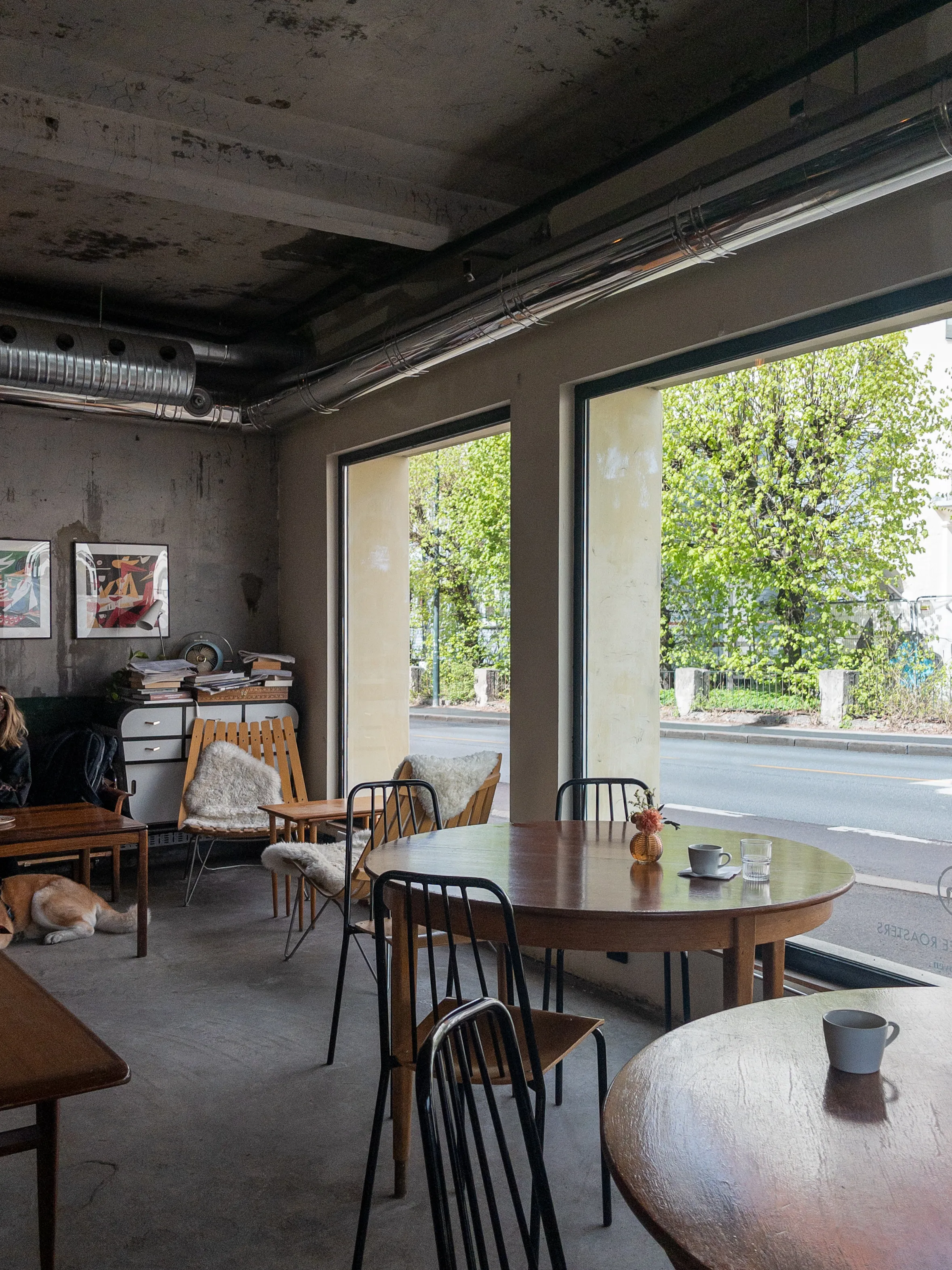
Photos of the cafe where testing took place.
Analysis: The webshop findings were analyzed using the same qualitative coding approach as the global website. Separate code sets were used for the global website and the webshop to capture platform-specific issues. For the webshop, observations were coded as: Goal achievement, Positive feedback, Valuable observations, and Negative feedback.
The coded observations were then grouped into themes through affinity mapping, helping identify recurring patterns and prioritize the most impactful opportunities for improvement.
The coded observations were then grouped into themes through affinity mapping, helping identify recurring patterns and prioritize the most impactful opportunities for improvement.
Key findings
The user testing revealed several opportunities to improve the shopping experience. While participants generally completed the assigned tasks successfully, their feedback highlighted areas where clearer communication, content, and interaction design could strengthen the overall experience.
01
The homepage communicated the brand, but not its story
Participants appreciated the visual design and atmosphere but felt the homepage focused too heavily on products, with too little emphasis on the people and story behind Fuglen. They wanted to understand more about the brand and expected this content to appear earlier on the homepage.
Why it matters: Without a stronger introduction to Fuglen’s story, users may not fully understand the brand’s unique identity, making it harder to build trust and to create a strong first impression.
Why it matters: Without a stronger introduction to Fuglen’s story, users may not fully understand the brand’s unique identity, making it harder to build trust and to create a strong first impression.
02
Product subscriptions needed more guidance
Users were able to navigate the subscription page but wanted clearer information to understand the differences between options and decide which subscription was right for them. More detailed descriptions and an FAQ were suggested to increase confidence.
Why it matters: Subscription services require users to understand the value and differences between plans before committing. Without clear guidance, users may feel uncertain about which option is right for them and be less likely to subscribe.
Why it matters: Subscription services require users to understand the value and differences between plans before committing. Without clear guidance, users may feel uncertain about which option is right for them and be less likely to subscribe.
03
The purchasing journey was intuitive, but information could be easier to find
Participants generally navigated the webshop successfully and found the experience welcoming, but encountered friction when looking for specific information. Limited search and filtering, unclear terminology, and a lack of accessible information about locations and events made some content harder to find.
Why it matters: Difficulty finding relevant information can create uncertainty and frustration, reducing users’ confidence in the webshop and their overall satisfaction with the experience.
Why it matters: Difficulty finding relevant information can create uncertainty and frustration, reducing users’ confidence in the webshop and their overall satisfaction with the experience.
What worked well: Participants consistently described the webshop as visually appealing, easy to navigate, and aligned with Fuglen's premium brand. The welcoming atmosphere and strong visual identity left a positive impression throughout the shopping experience. Additionally, participants completed the checkout flow without major usability issues, suggesting that the purchasing process was generally intuitive.
Accessibility analysis
Evaluating Fuglen's platforms against the WCAG 2.1 guidelines
Alongside usability testing, I evaluated both Fuglen's global website and webshop against the WCAG 2.1 guidelines. The goal was to identify accessibility barriers that could affect users with different needs and provide practical recommendations to improve the overall experience.
Approach
To evaluate the accessibility of Fuglen’s digital platforms, I combined automated testing with manual review. While automated tools helped identify technical issues, manual evaluation allowed me to assess the experience from a user's perspective and uncover barriers that tools alone could not detect.
MANUAL REVIEW
- Keyboard accessibility and interactive elements
- Text readability and contrast
- Content structure and heading hierarchy
- Alternative text and image descriptions
AUTOMATED TESTING TOOLS
- WAVE - identifies WCAG-related issues such as missing alt text, contrast problems, and structural errors
- accessScan - automated accessibility scanning of selected pages
- Chrome DevTools - inspects HTML structure and accessibility-related elements
Key findings
The accessibility evaluation identified several barriers affecting readability, navigation, and content access. To help Fuglen prioritize improvements, I grouped the findings into two categories based on user impact, accessibility importance, and implementation effort.
Priority 1
MUST FIX
These findings are considered high impact, yet relatively straightforward improvements to implement.
01
Readability barriers affected access to content
Small font sizes, low contrast between text and backgrounds or images, and typography choices reduced readability across parts of the website. The selected typeface also appeared visually smaller than other commonly used, more readable fonts at the same size.


Example of insufficient contrast on the original photo (left/top) vs. an easily improved contrast on the photo to the right/bottom.
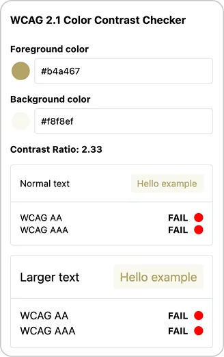
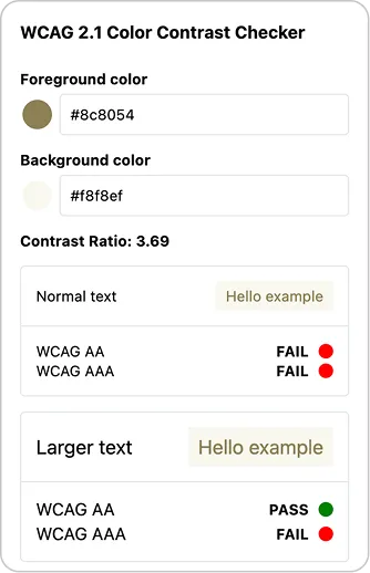
Screenshot from Figma's contrast checker tool showing the difference a slightly darker font color can make in terms of readability (for larger text).

Comparison of different typefaces at the same font size, illustrating how font choice affects perceived readability. The font used on the website is in the middle.
02
Images lacked meaningful alternatives
Some images did not include alternative text, including cases where important information was communicated through text embedded directly in images. This created barriers for users relying on screen readers.
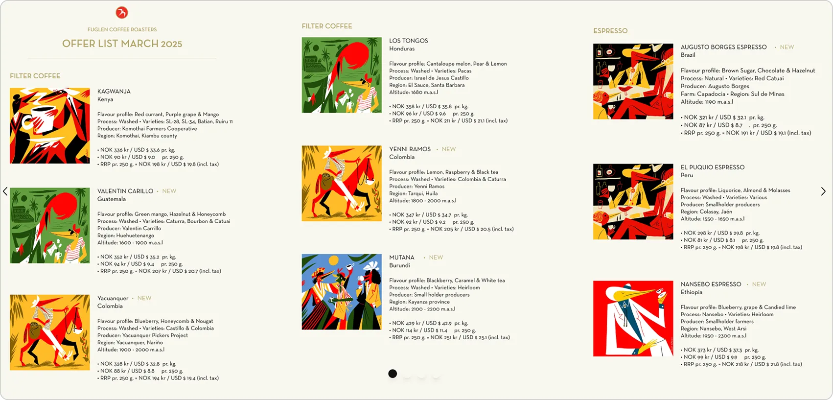
Example of images containing important text that lacked alternative text, making the information inaccessible to screen reader users.
03
Heading structure affected content navigation
Inconsistent heading use and multiple H1 headings on some pages made the content hierarchy unclear. This made the content harder to scan and reduced the usefulness of headings for users navigating with assistive technologies.
Priority 2
SHOULD FIX
These improvements are important but less urgent and require more structural changes, making them less straightforward to implement.
01
Content density affected readability
Large amounts of information and wide text blocks made content harder to scan and process.
02
Inconsistent content patterns created confusion
Similar content was presented differently across pages, making it harder for users to understand and navigate the website. Breadcrumb navigation was also not consistently available, which made it difficult for users to understand their location within the site.
03
Unclear use of color reduced content clarity
The use of multiple colors for body text made the content hierarchy and meaning harder to understand.
Recommendations
Practical recommendations based on the key findings
The insights from usability testing and the accessibility audit were combined into a set of practical recommendations for each platform, addressing their different user needs and business goals.
Global website
Improve navigation and site structure
- Simplify navigation labels and menu structure
- Make key information easier to discover
- Improve transition between the global website and webshop
Organize content more effectively
- Create a clearer content hierarchy across pages
- Reduce visual clutter and unnecessary scrolling
- Group related information together to improve scanability
Strengthen brand communication
- Bring together information about Fuglen's story, values, coffee, and partnerships
- Improve content hierarchy to reduce cognitive load
- Make contact information and business opportunities easier to find
Webshop
Streamline product discovery
- Enhance search functionality and filtering
- Make product categories easier to browse
- Make search results more relevant to users’ queries
Clarify the subscription options
- Explain subscription options more clearly
- Add supporting information such as an FAQ to answer common questions
Strengthen brand communication
- Balance product-focused content with brand storytelling
- Better communicate Fuglen’s community and experiences beyond the coffee itself
- Make information about cafés, locations, and events easier to find
Accessibility improvements relevant to both platforms
- Improve readability through clearer typography, contrast, and spacing
- Strengthen content structure with consistent headings and page hierarchy
- Make visual content accessible through meaningful alternative text and accessible image usage
- Support inclusive interaction through better keyboard navigation and clearer interactive elements
Deliverables
The findings and recommendations were compiled into reports delivered to Fuglen, providing the team with a structured overview of usability issues, accessibility barriers, and suggested improvements. These materials were intended to support future design iterations and help the team make informed decisions when updating their digital platforms.
The deliverables included:
The deliverables included:
- UX research report summarizing user testing findings and opportunities for improvement
- Accessibility reports evaluating both platforms against WCAG guidelines, including prioritized issues and recommendations
Reflection
What I learned from this project
Recognizing my own biases in research
Conducting usability testing with real users was one of the most valuable parts of this project. It made me realise how easily my own expectations as a designer can influence the way I interpret and guide a session.
During the webshop testing, I noticed that I sometimes prompted participants more than I intended when they were quiet during the think-aloud process. I had to remind myself that silence does not necessarily mean that a user needs help, and that giving people space to form their own thoughts can reveal more than guiding them towards an answer. This experience made me more aware of my own biases and the importance of stepping back and observing before making assumptions about what a user is thinking.
During the webshop testing, I noticed that I sometimes prompted participants more than I intended when they were quiet during the think-aloud process. I had to remind myself that silence does not necessarily mean that a user needs help, and that giving people space to form their own thoughts can reveal more than guiding them towards an answer. This experience made me more aware of my own biases and the importance of stepping back and observing before making assumptions about what a user is thinking.
UX recommendations don't exist in vacuum
This project taught me that identifying a UX problem is only part of the process. The solution also needs to make sense for the organisation, its priorities, and what is realistically possible to implement.
The accessibility audit revealed many areas that could be improved, but I had to consider which changes would have the greatest impact and which were realistic for Fuglen to take on. This made me think more carefully about how I prioritise findings and communicate recommendations, rather than simply presenting a long list of everything that could be improved.
The accessibility audit revealed many areas that could be improved, but I had to consider which changes would have the greatest impact and which were realistic for Fuglen to take on. This made me think more carefully about how I prioritise findings and communicate recommendations, rather than simply presenting a long list of everything that could be improved.
Overall, this project strengthened my belief that effective UX design is built on curiosity, research, and continuous reflection. Creating better experiences requires both understanding the users and being willing to question and improve my own approach as a designer.