
Summary
Concept project | March - April 2024
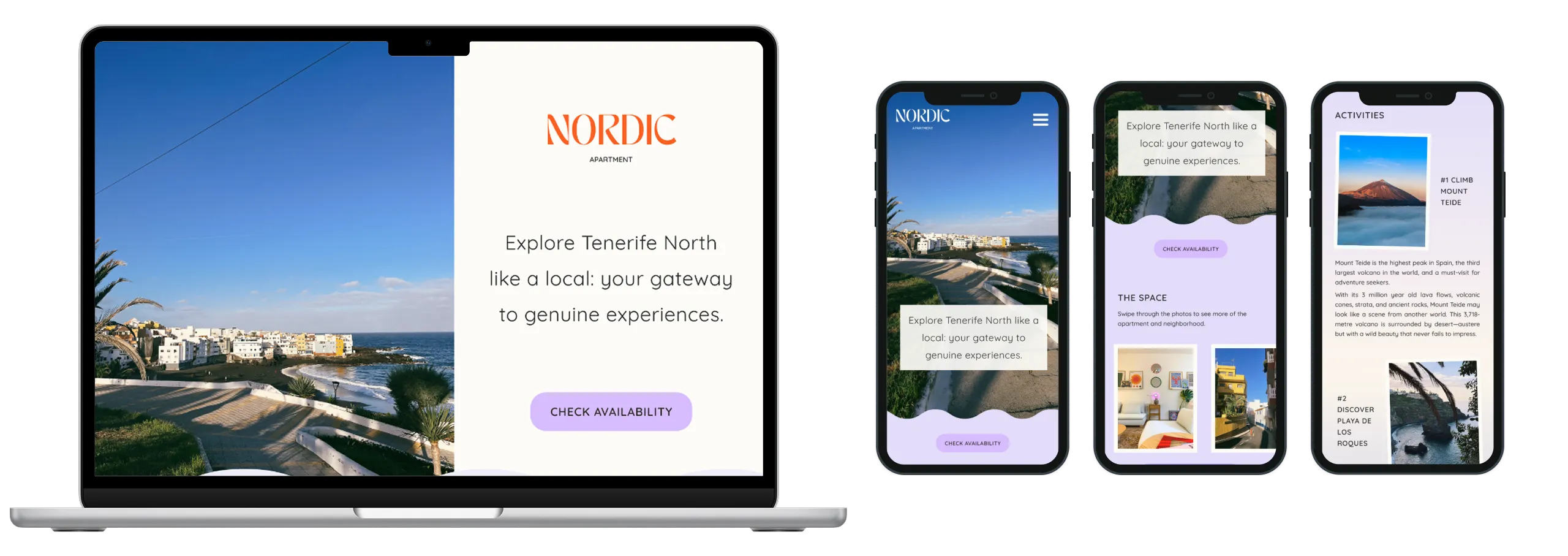
For this project, I designed Nordic, a responsive website prototype for a fictional accommodation service, tailored for both desktop and mobile. I explored how AI and time-saving tools could support different parts of the design process, from generating content and visuals to exploring layouts and components, while maintaining a strong focus on UX, accessibility, and responsive design.
The project included desktop and mobile designs, an interactive calendar with dynamic pricing, and a tailored checkout flow, with a focus on creating a clear and user-friendly booking journey. It also challenged me to find the right balance between using existing tools and resources to work efficiently, and making custom design and UX decisions where they added the most value.
The project included desktop and mobile designs, an interactive calendar with dynamic pricing, and a tailored checkout flow, with a focus on creating a clear and user-friendly booking journey. It also challenged me to find the right balance between using existing tools and resources to work efficiently, and making custom design and UX decisions where they added the most value.
My role
UX/UI Designer
Focus
Responsive design
Interaction design
Prototyping
AI-assisted content
Tools
Figma
ChatGPT
Canva
Figma Community
Color Name Generator
Deliverables
Responsive desktop & mobile prototypes
Challenge & approach
Defining the problem and outlining the process
The challenge
The main challenge was finding the right balance between efficiency and creative control. I wanted to create something that felt more personal than a typical hotel booking experience, while still making it easy for people to explore the apartment, check availability, and book their stay.
As someone who enjoys working with details and refining designs, I also had to consider which parts of the process were worth doing myself and where it made sense to rely on existing solutions or AI. The goal was not simply to work faster, but to find a more effective way of working.
As someone who enjoys working with details and refining designs, I also had to consider which parts of the process were worth doing myself and where it made sense to rely on existing solutions or AI. The goal was not simply to work faster, but to find a more effective way of working.
The approach
01
Defining the target audience
02
Establishing a visual direction
03
Exploring ways to make the design process more efficient
Defining the concept
Defining the audience, positioning, and visual direction
With the overall direction established, I focused on defining who the experience was for and what it should communicate. I used the target audience as a starting point for shaping the concept, brand personality, and visual direction, creating a foundation for the design that followed.
Target audience & positioning
I designed Nordic for young travellers, couples, and close friends looking for a more personal alternative to a traditional hotel stay. The experience was intended for people who value character, creativity, and the opportunity to experience the local area rather than simply visit a popular destination.
Perfect for those who like to be in hip, carefully curated spaces filled with creative details. Located 1min walk away from a black sand beach and a 15min walk away from the lively town of Puerto de la Cruz. The neighbourhood is full of locals and has its own cafes, restaurants and bars, where you can slip right into Canarian lifestyle.
Establishing the brand
The apartment itself shaped much of the visual direction. Its clean, Nordic-inspired furniture is mixed with colourful and eclectic details, so I wanted the brand to feel clean and approachable while still being warm, playful, and distinctive.
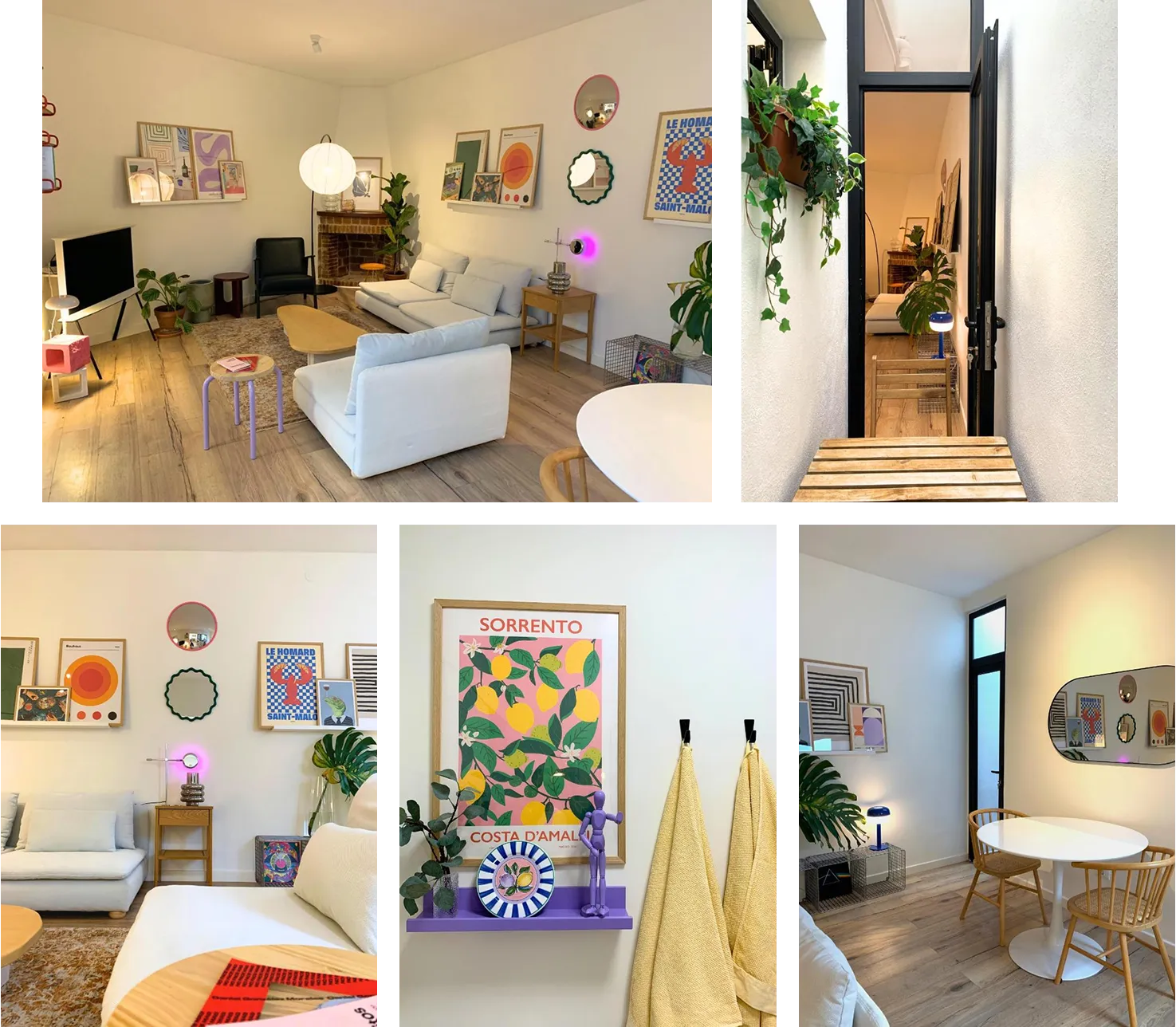
Photos of the apartment taken by the owners.
Using Canva, I explored typography, logo options, and color palettes before establishing a design system that captured the atmosphere I wanted the brand to communicate.
The result included typography for desktop and mobile, primary colours and shades, gradients, buttons, and the final logo. I also introduced soft, organic shapes in the background to add warmth and movement to the pages.
The result included typography for desktop and mobile, primary colours and shades, gradients, buttons, and the final logo. I also introduced soft, organic shapes in the background to add warmth and movement to the pages.
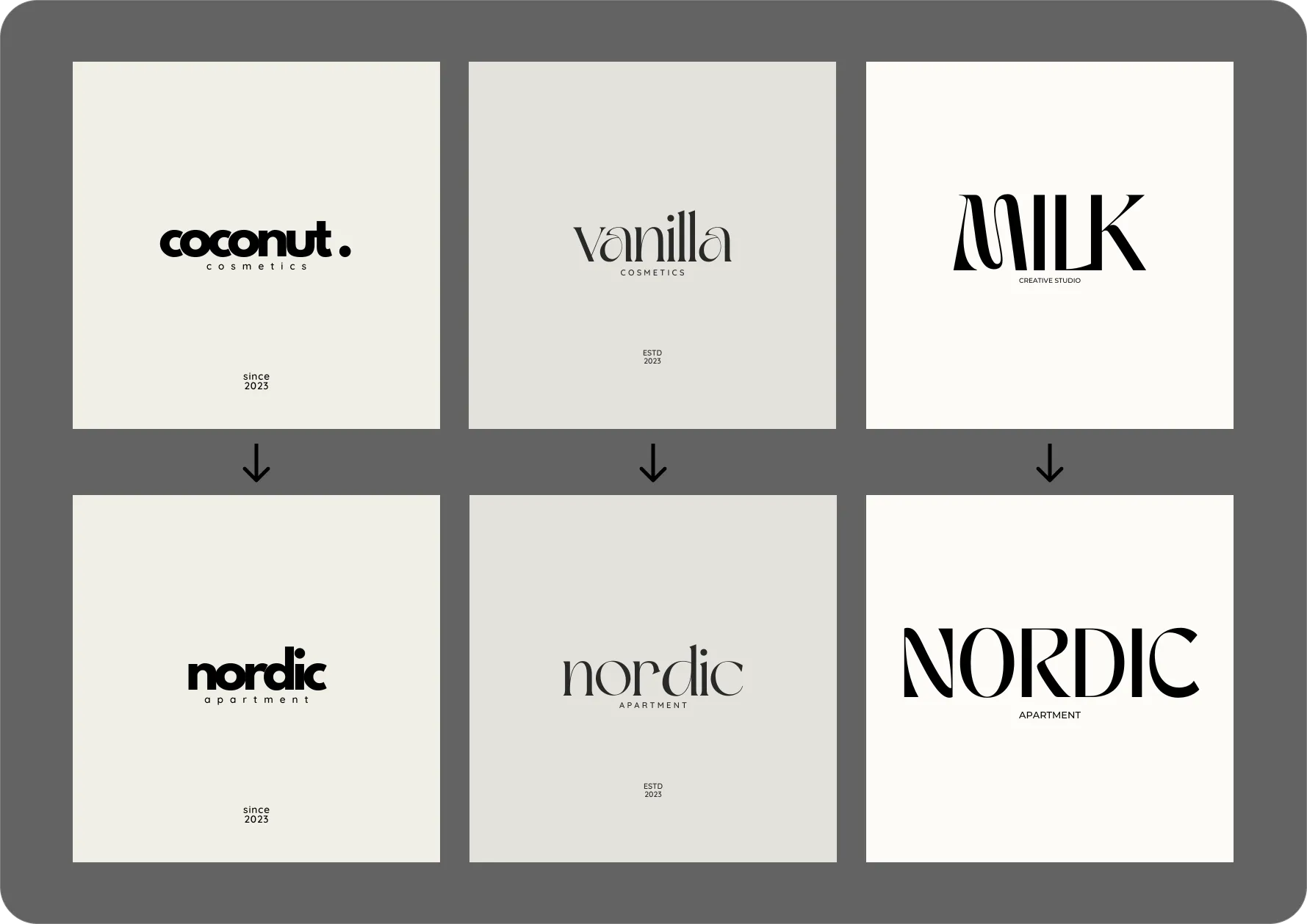
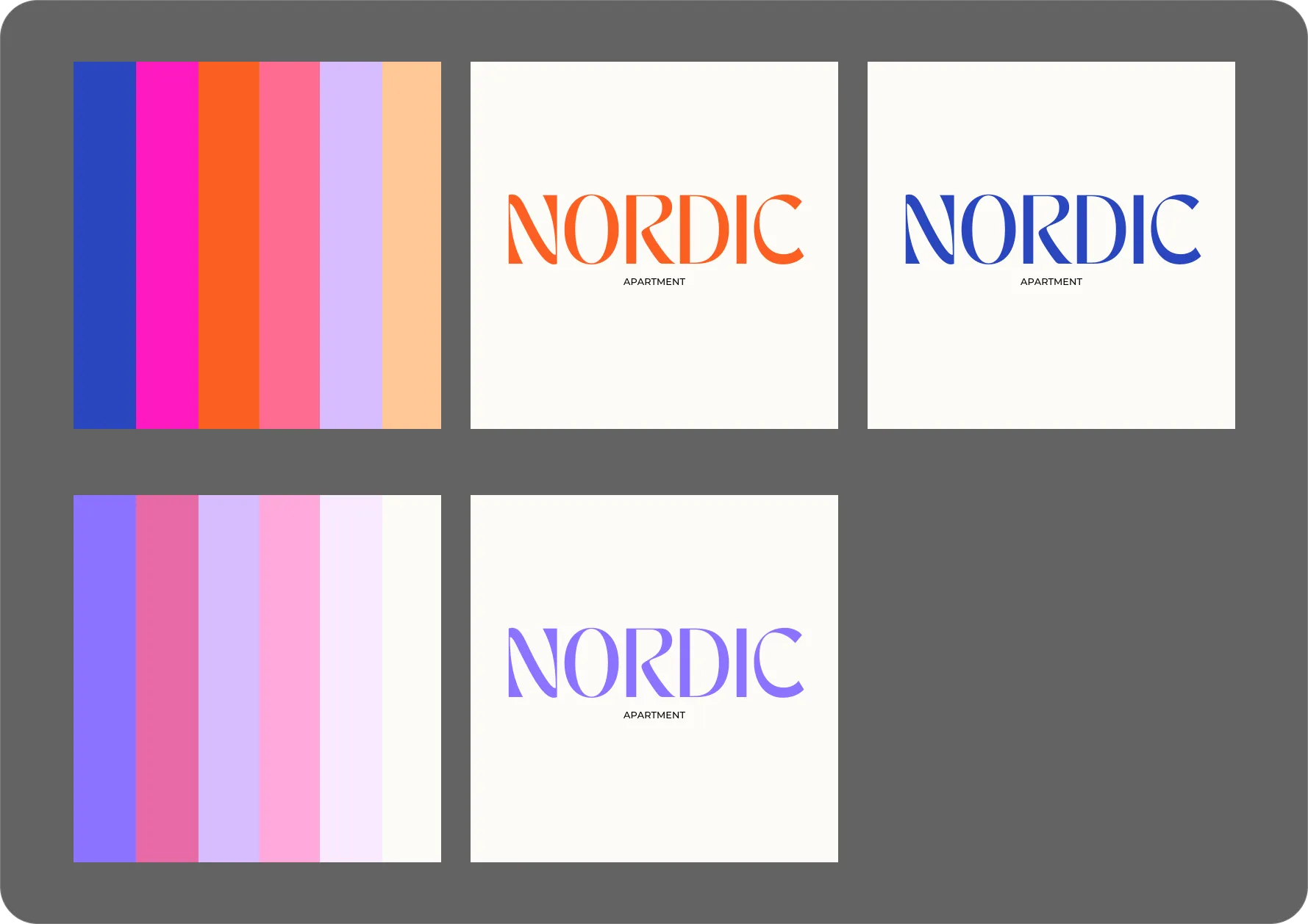
Canva font combinations I initially considered for the project (on the left) and one of the selected fonts in different color palettes (on the right).
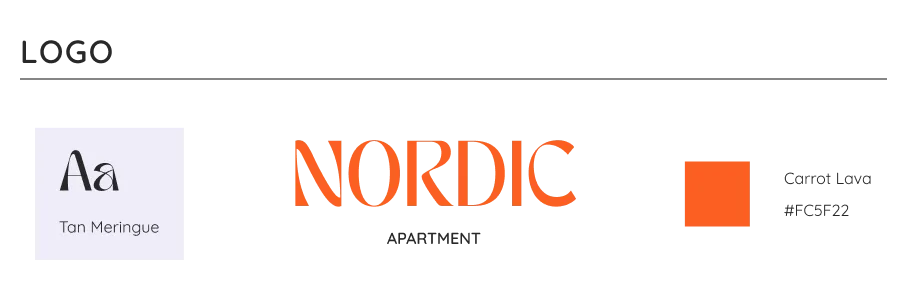
The final logo, font and color choice made for Nordic.
Developing the design system
After selecting the colors that best captured the apartment's mood and atmosphere, I used a Color Name Generator to give each color a unique name. I then combined the selected colors with the chosen typography to establish a cohesive visual foundation for the website.
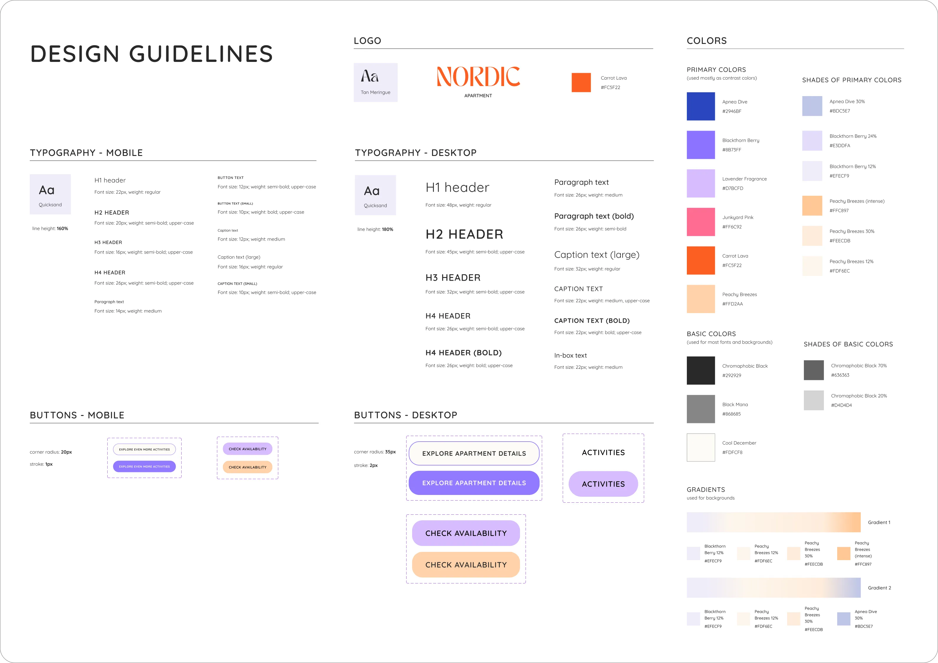
The final design guidelines developed for the project (click to zoom in).
Designing the experience
Designing the booking experience from discovery to checkout
With the concept and design system established, I moved on to designing the full accommodation booking experience. I structured the experience around the user's journey - from discovering the accommodation and exploring the space to checking availability and completing a booking.
Discovering the accommodation
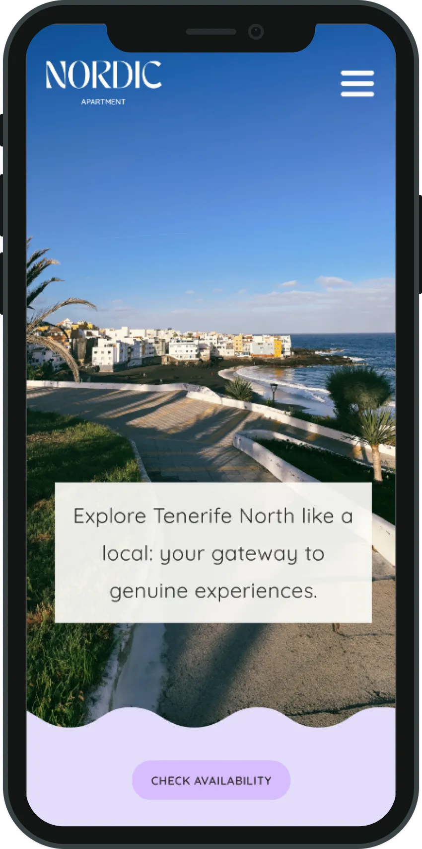
The hero section intentionally combines visual hierarchy, contextual information, and clear navigation to create a strong first impression and encourage further exploration.
Visual introduction
Large-scale photography creates an immediate emotional impression of the destination and the accommodation's character.
Location context
The destination name helps visitors quickly understand where the accommodation is situated and what kind of experience it offers.
Clear next step
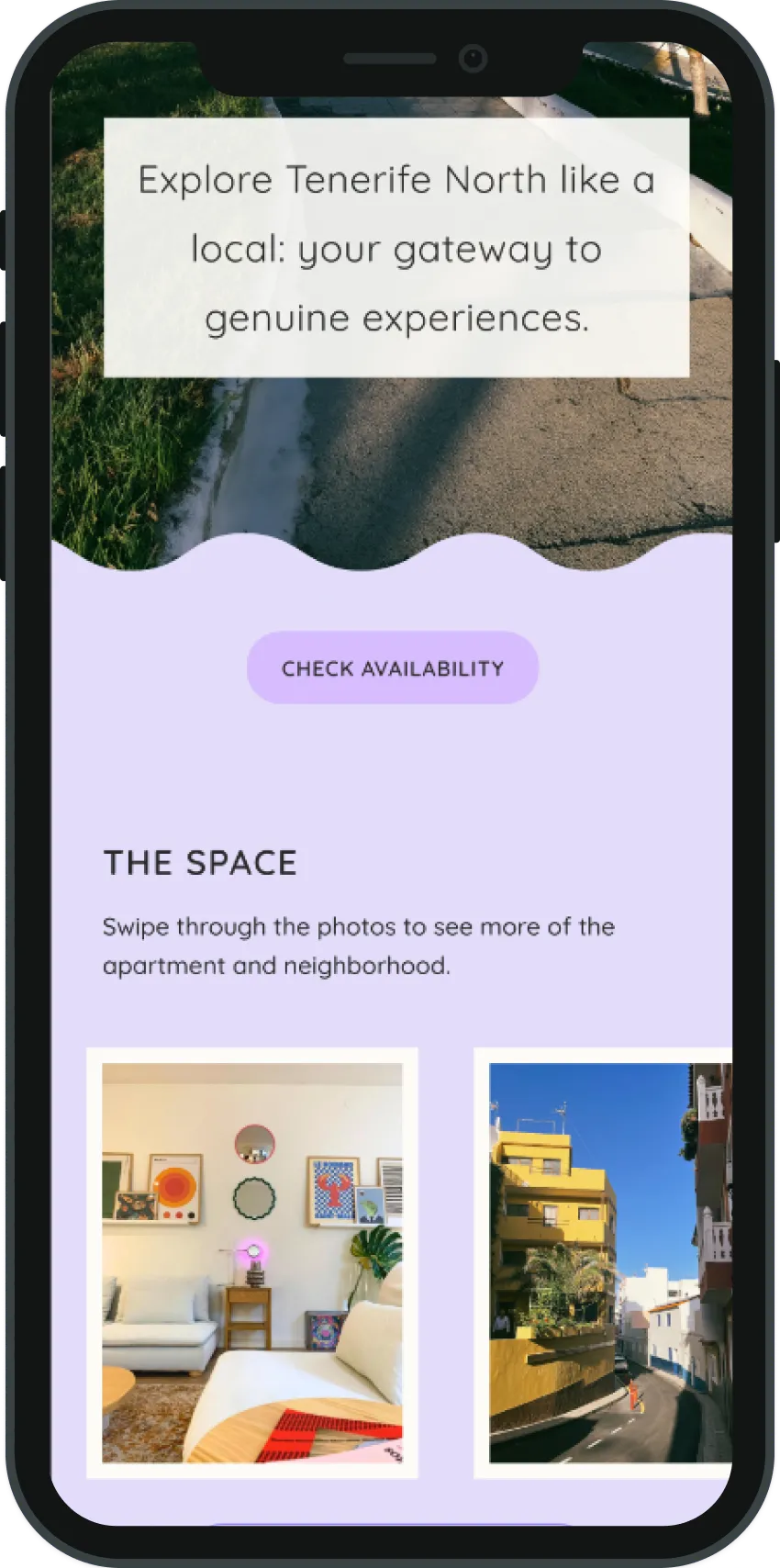
A prominent call-to-action gives visitors an obvious path forward, whether they want to explore the accommodation or check availability.
As users continue exploring, information is revealed progressively, moving from the destination to the accommodation itself, with dedicated pages providing details about the space and nearby activities.
As users continue exploring, information is revealed progressively, moving from the destination to the accommodation itself, with dedicated pages providing details about the space and nearby activities.
Checking availability & booking
The booking journey continues with an interactive calendar that allows users to select dates and see pricing update dynamically based on their choices. I adapted an existing Figma Community component, refining its visual design and interaction logic to fit the project.
I also adapted an existing payment and checkout flow, creating a continuous journey from selecting dates to reviewing the booking and completing the reservation.
I also adapted an existing payment and checkout flow, creating a continuous journey from selecting dates to reviewing the booking and completing the reservation.

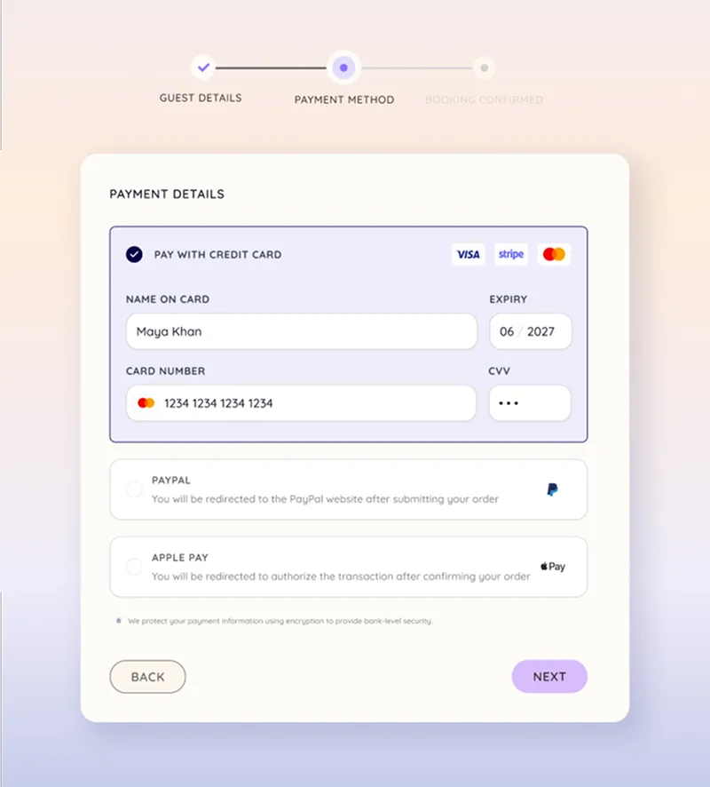
The interactive booking calendar (left) and the payment flow widget (right). Click to zoom in.
Tools used
Using AI and digital tools to work more efficiently throughout the design process
Throughout the project, I explored a range of AI-powered tools, reusable resources, and learning materials, focusing on where they could reduce repetitive work, speed up exploration, or help me develop new skills.
ChatGPT
WRITTEN CONTENT
Used for early concept exploration and refining website copy, helping me iterate quickly while keeping the final content under my control.
Canva
DESIGN SYSTEM
Used to explore typography combinations, color palettes, and develop the visual direction.
Figma Community
UI RESOURCES
Used to source reusable components and widgets, which I adapted and customized to fit the project.
YouTube tutorials
LEARNING
Used to learn and improve techniques for creating the responsive mobile experience in Figma.
Unsplash
IMAGES
Used a combination of authentic photography and selected stock imagery to support the visual storytelling.
Key takeaways
What I learned from this project
I learned that efficiency isn't always about finding the quickest solution. Existing tools can be a great starting point, but knowing when to adapt them and when to create something custom is an important part of the design process.
For example, adapting the booking calendar and adding dynamic pricing wasn't particularly time-saving, but it taught me a lot about Figma variables and interaction design. I wouldn't change that. It helped me understand when a custom solution adds real value, and when an existing one is good enough.
For example, adapting the booking calendar and adding dynamic pricing wasn't particularly time-saving, but it taught me a lot about Figma variables and interaction design. I wouldn't change that. It helped me understand when a custom solution adds real value, and when an existing one is good enough.